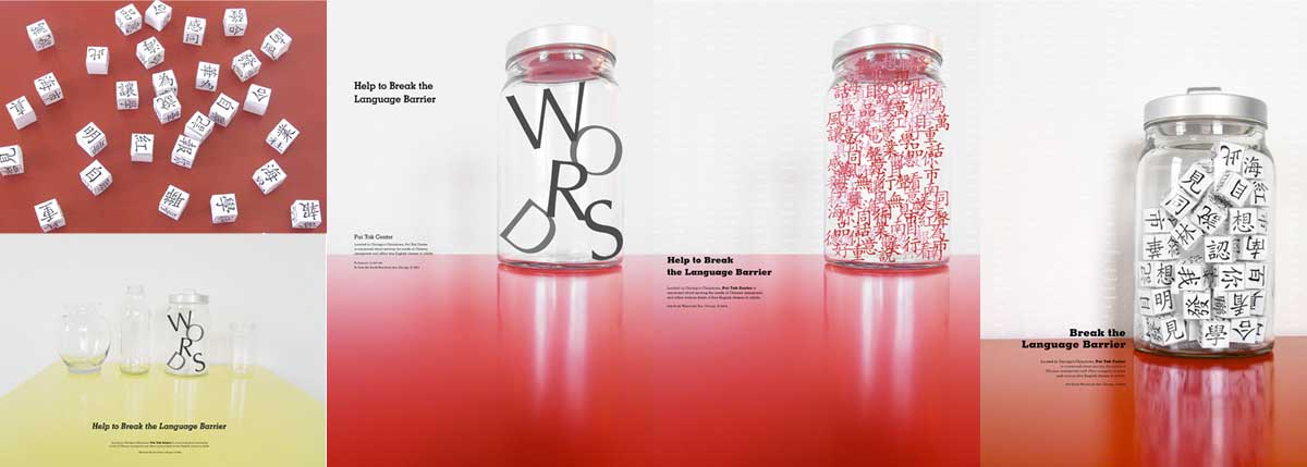
Designed for Chicago's Pui Tak Center, a non-profit organization serving the needs of Chinese immigrants and offering free English classes for all ages, my identity and poster design carries through the concept of breaking the language barrier and overcoming alienation.
Pui Tak Center
Brand Identity & Poster Design, 2011
Carrie Sijia Wang
Work completed while attending School of the Art Institute of Chicago

Research
Before starting to design, I went to Pui Tak Center a few times to talk to students, teachers and the center’s director to their perspectives on what Pui Tak Center was and how they experienced it. I took some photos for documentation and even attended one of the English classes to get a better idea about the organization on a personal level.

Logo Concept
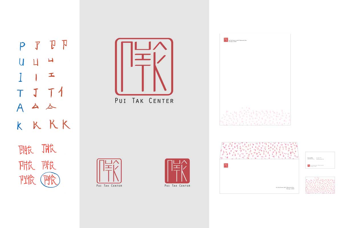
Inspired by the appearance of a traditional Chinese seal, the logo rearranges English letters into the form of a Chinese character. The logo integrates both languages and the seal-like form symbolizes Pui Tak center making marks in the Chinese community.
To use English letters to form a believable Chinese character, the first step was to make the letters into seemingly Chinese radicals (bushou).
Then I made some faux Chinese characters with the reformed letters. From the characters sketched, I chose the most believable one as the basic element of my logo.
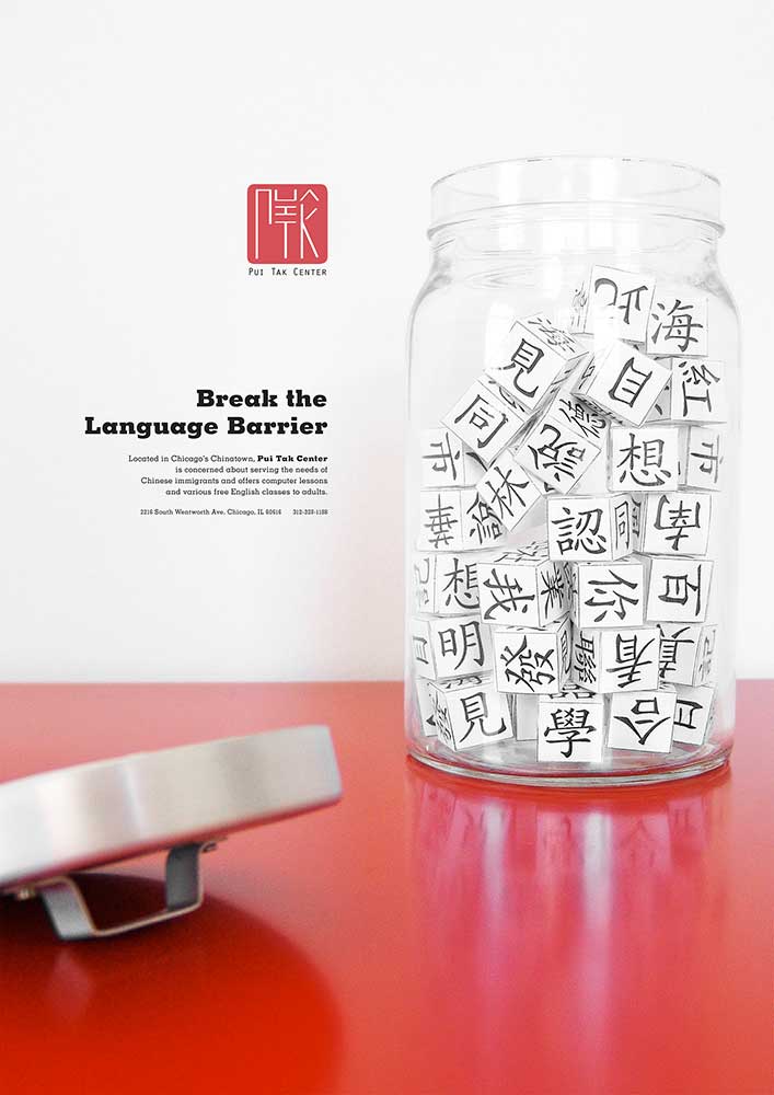
Poster Concept
From my own experience as an international student with English being my second language, I use a glass jar to portray the experience of living with a language barrier.
